Type and name
This is an empty Skin.

Header of the Skin is its full name: First part is Component Type, second part is Skin's name. This Skin is applied to CustomContent and its name is "Skin's Tutorial".

When you click on icon after Skin's name, text area will appear and you can add description to your Skin.

There is an error notification area - it is in the upper right corner. When it is green, your code is valid.

If you have error/s in your code, error marker will become red.

Tabs
There are different tabs with options inside:
- Content - here you will write code here and you can find several menus

-
- Usage - here you can manage Skin's behavior
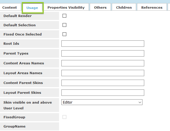
- Property Visibility – choose which properties to be shown at all and in Easy tab
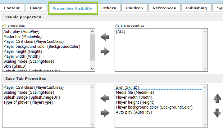
-
- Others – additional options
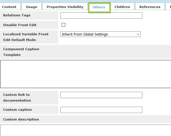
- Children – Possible child components
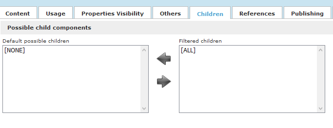
-
- References - set JavaScript and/or CSS Components, that will be applied to ONLY to current Skin

-
- Publishing - show/hide Skin based in several conditions

Content Menu
Inside content tab above the coding text field there is a menu with different options:
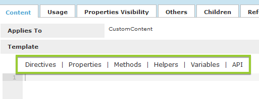
We are going to check them in details in next articles.